Predicting the Salary of MLB Players
Jack Banks, Nick Thurkow-Schlund, Ansh Shah, Anand Tanna
Introduction
The question we are trying to answer with our project is do MLB players get paid more based on how well they hit? To do this, we wanted to examine data from 1985 onward (when salary data is public). In order to do this, we are examining data of thousands of baseball players’ seasons since 1985. In order to figure out if it is possible to predict salary just from hitting stats, we want to create several linear and transformed models that can attempt to predict salary. Some of the variables include hits, at bats, batting average, runs, runs batted in, strikeouts and on base percentage.
We also want to have fun and learn more about the game of baseball and current statistical trends in the game.
Methods
The first thing we wanted to do was look at trends in MLB data since it began being collected in the year 1871.
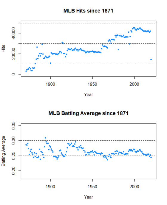
Hits and Batting Average are two very important stats that are often very correlated. However, we see that hits rises while batting average bounces back and forth between .250 and .300 until it falls below .250 very recently.
Hits looks to climb up a ladder, jumping up around the same time MLB expands and adds new teams, allowing for more players to get more hits.
Let’s look at four more just for fun.
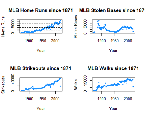
Stolen Bases has a strange little parabola dipping down around 1950, but other than that it isn’t changed much.
On the other hand, Home Runs, Strikeouts, and Walks have huge upward trends, especially in recent years. These are known as the “Three True Outcomes”, where the ball is not put in play for the fielders. Let’s see how the three true outcomes are trending as a percentage against all plate appearances
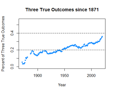
Definitely on a rise, an interesting trend for sure. We’ll see if there’s any meaning in that.
Predicting Salary
Our first dataset only looked at hitting statistics. Now we are merging that dataset along with another that contains the salaries of players from 1985 onward.
There are still issues, when looking at the data a ton of players have NA for BA and other similar categories, because they never batted, they are pitchers! We want to remove these data because players with too few at bats or hits will confound our models.
Also four categories towards the end became boolean, which will l ead them to be removed
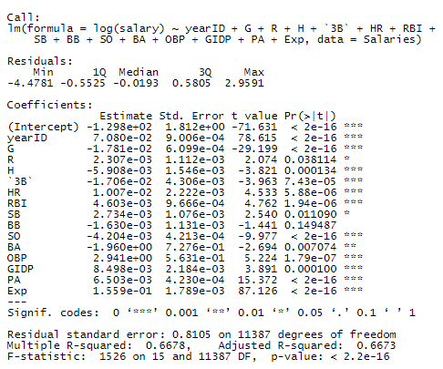
This is the first model we wish to test. It contains all variables except a handful of identification variables that aren’t necessary.
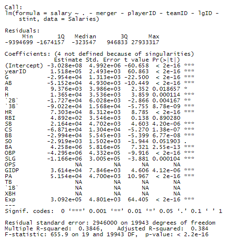
We notice that there are a lot of non-significant variables and some that are linear combinations of other variables. Also, the R2 value is very low. We can subtract OPS, TB, 1B, XBH, for now, as they are linear combinations of other variables.
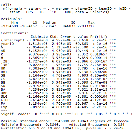
We expected the model to be almost the exact same, and that’s what we see.
With our first model, we wanted to predict the salary of the players and plot it against the actual salary. We used predict() and ggplot to create the following graph.
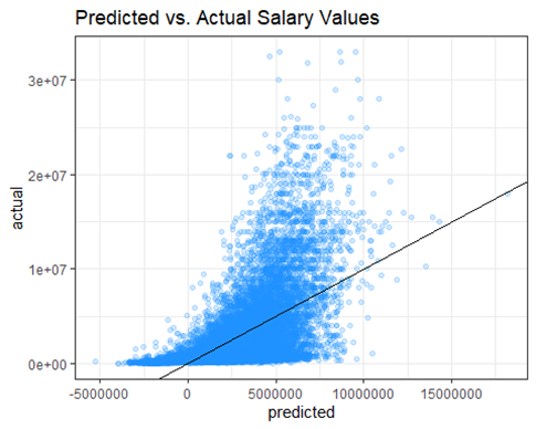
Oof sometimes our model predicts a negative salary
Yea, predicting salary can be tough.
There are obviously a few problems with the first graph and model. A player cannot have a negative salary and the data is very heteroskedastic. With an earlier R2 value of 0.3846, this model is not a good choice.
In order to try and remedy this, we take several steps. First, we clean the data more by eliminating those who had less than 100 at bats in a season. This can skew the data because if they got injured or didn’t play for another reason, they may have a large salary that messes with the model. We also recognized that these could also be pitchers. Pitchers usually bat very little but can earn a very high salary. We attempt to remove those from the data as well since they can possible screw the data. Additionally, there were people who had a salary of $0, which isn’t possible, so we removed those data points.
Next, we tried to fix the previous model by taking a log transformation of the response variable, salary. We created another model with the same predictor variables and then plot it.
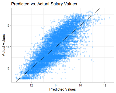
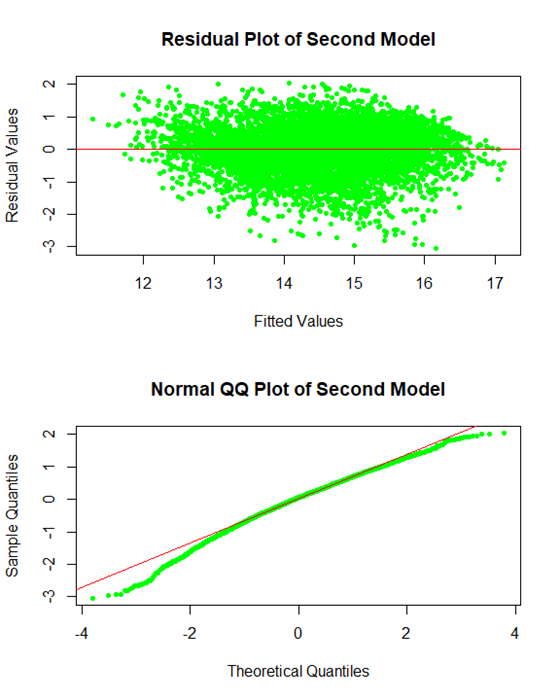
It looks much better and the eye test suggests linearity. We also want to check the residual plot.
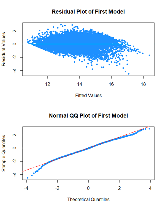
The last thing we did was create a Q-Q Plot to assess normality of the data. For the most part, it looks good except for the data at the beginning. We theorized this was because of rookie deals.
Typically, rookies are paid less even if they produce the same amount of hits and veterans because they’re new to the league. With similar stats, one veteran player could make 5-10 times as much as a rookie, which can mess with the data.
To attempt to fix this, we will create a subset of the data where we only had players who were in their fifth season at the least.
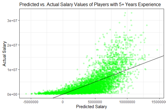
The data only looks a tiny bit better than the first, but we repeated the same process with a log transformation on the response variable, salary.
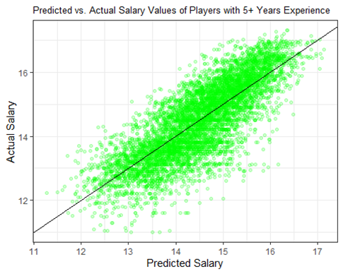
The data is rather linear again, which was expected.
To see the Q-Q Plot like this was surprising. It is suggesting even less normality than the first model, even though we attempted to remove the noise at the beginning. We decided not to use this model after this since the errors appeared to interfere too much.
Additionally,
The R-Squared Value of our first log model is 0.667887, which is greater than this new model’s value of 0.6469538
Finally, let’s create a model with only the most significant predictors. To do this, we will use AIC.
In this model, we see that every predictor except for one is significant! This is very efficient.
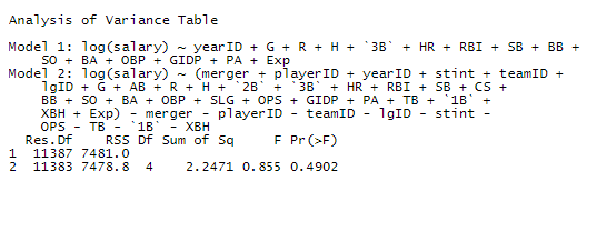
After the ANOVA test, we saw that there was not enough evidence to reject the null hypothesis that the AIC model and our first model are significantly different. This means we were able to make a simpler model that does the same predictive job.
In fact, in terms of efficiency, our AIC model is better than the full model, as it’s Adjusted R-Squared is 0.6673496, which is higher than the value from our first full log model: 0.6673327
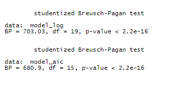
Finally, we did a Breusch-Pagan Test to check for the constant variance assumption, which both models violate. I guess neither are perfect, but compared to how they looked before our log transformation, I say they’re much better.
Results
When deciding which model was best, we wanted to take a look at R2, Adjusted R2, Normality and Constant Variance assumptions, among other things. We immediately ruled out the model predicting salary among experienced players because of normality violations. We decided that the AIC model was the best one because the Adjusted R2 is slightly better than our first model. It’s more efficient in its predictions even with a lower R2, it has more predictive power while being a simpler model.
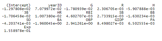
These are the coefficients for the AIC Model.
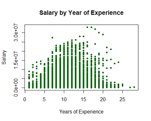
Now let’s look at three fun plots on some of the more highly significant predictors
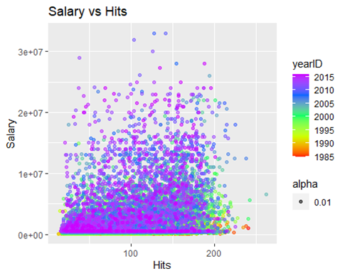
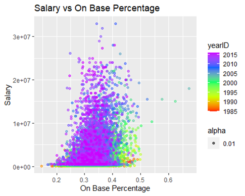
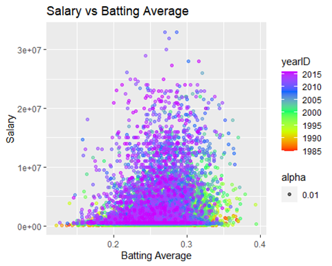
These three plots tell the same story, it isn’t surprising to see a pocket of players from an older era in the right part of the curve. Players in the current era are more focused on hitting home runs than simply getting on base, which is seen above, and was seen earlier when we looked at the three true outcome trend.
The pocket of players in green and yellow played during a not-too distant time when putting the ball in play and getting on base was prioritized more than hitting a home run.
Discussion
Our model attempts to predict a players salary from a variety of predictors. For the most part, we can somewhat predict a players salary, how much they are worth to the league. Our model also helps us find players who are producing above their pay grade, meaning they are undervalued and will be getting a nice contract in free agency.
We do this below with Mookie Betts, a very promising young player who only made $566,000 in his third year (2016, where he finished second in MVP voting).
At his current experience level of 3, our model predicts him to make $4,528,031, which is much more than he actually made, but not as much as he could…
We will now attempt to predict his salary if he had put up those same numbers in his 12th season by changing his experience value from 3 to 12.
We see that if Mookie was in his 12th season, our model would have predicted him to make a whopping $18,599,769!
Why did we choose the 12th year, if technically our model will predict his salary, and anyone’s salary for that matter, all the way up to infinity with enough years in the league? But that’s extreme extrapolation.
We chose the 12th season because this plot shows us it’s when players tend to get their biggest paychecks.
But that was 2016, five whole years ago. If you’re wondering if Mookie Betts finally got the contract he deserves, don’t worry, he’s doing great.
Betts won the MLB award in 2018, as well as winning the World Series with the Red Sox in 2018 and the Dodgers in 2020. This past offseason he signed a 12-year, $365 million contract with the Dodgers.
Maybe our model was on to something…
Conclusion
This model has extreme importance. If you’re an MLB organization, this model could be used to make sure you’re not overpaying for a player on the free agent market, and can help you target the players that you could get a great deal on. For players already in your organization, this model could help you make sure you pay your promising young talents the money that they deserve, so that you can lock them down long term.
Our model is decent but not perfect. We can somewhat accurately predict salary with just hitting numbers. However there are many intangible factors that we can’t include in this type of model such as player tenure, franchise loyalty, young player potential, injuries, draft busts and reputation.
Hopefully, over time, more and more datasets will become available for analysis like this, with sabermetrics such as WAR (Wins Above Replacement), as those may do a much better job of predicting salary. But until then, creating a rather effective model with simple statistics was a great exercise in learning how front offices really value players.